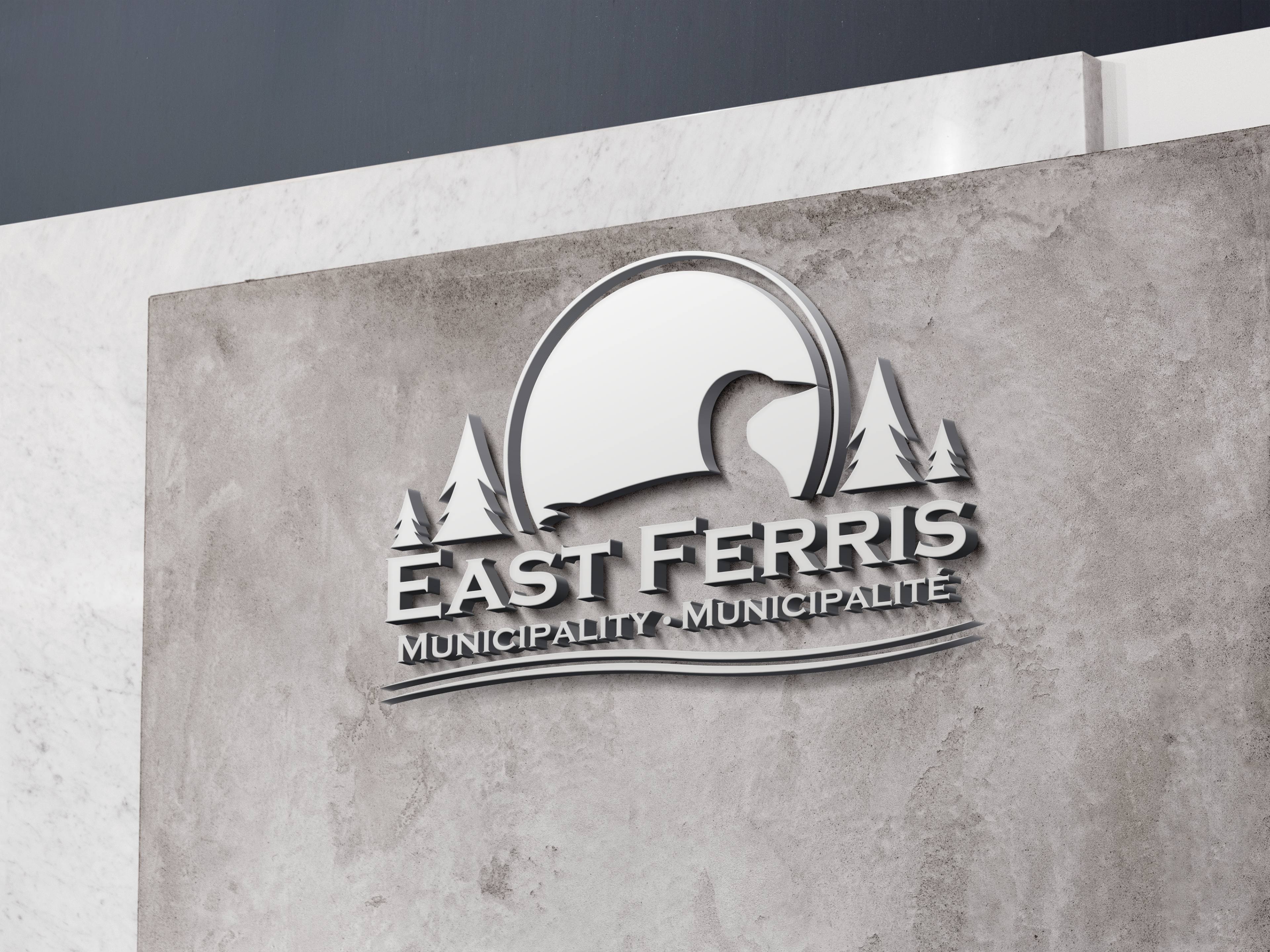
The objective of the logo design was to encapsulate the essence of East Ferris, reflecting both its visual identity and contemporary aesthetics. Extensive research led to the incorporation of tapered wave elements—a prevalent motif in modern logos—and the strategic use of negative space to create a visually compelling image. Recognizing the trend in municipal logos to favour architectural elements, a conscious decision was made to diverge from this norm. Instead, the design reintroduces an animal representation, reimagined in a modern context, to serve as a symbolic figure synonymous with the region. This approach honours the locality’s unique attributes and positions the logo as a distinctive and memorable symbol within the community.

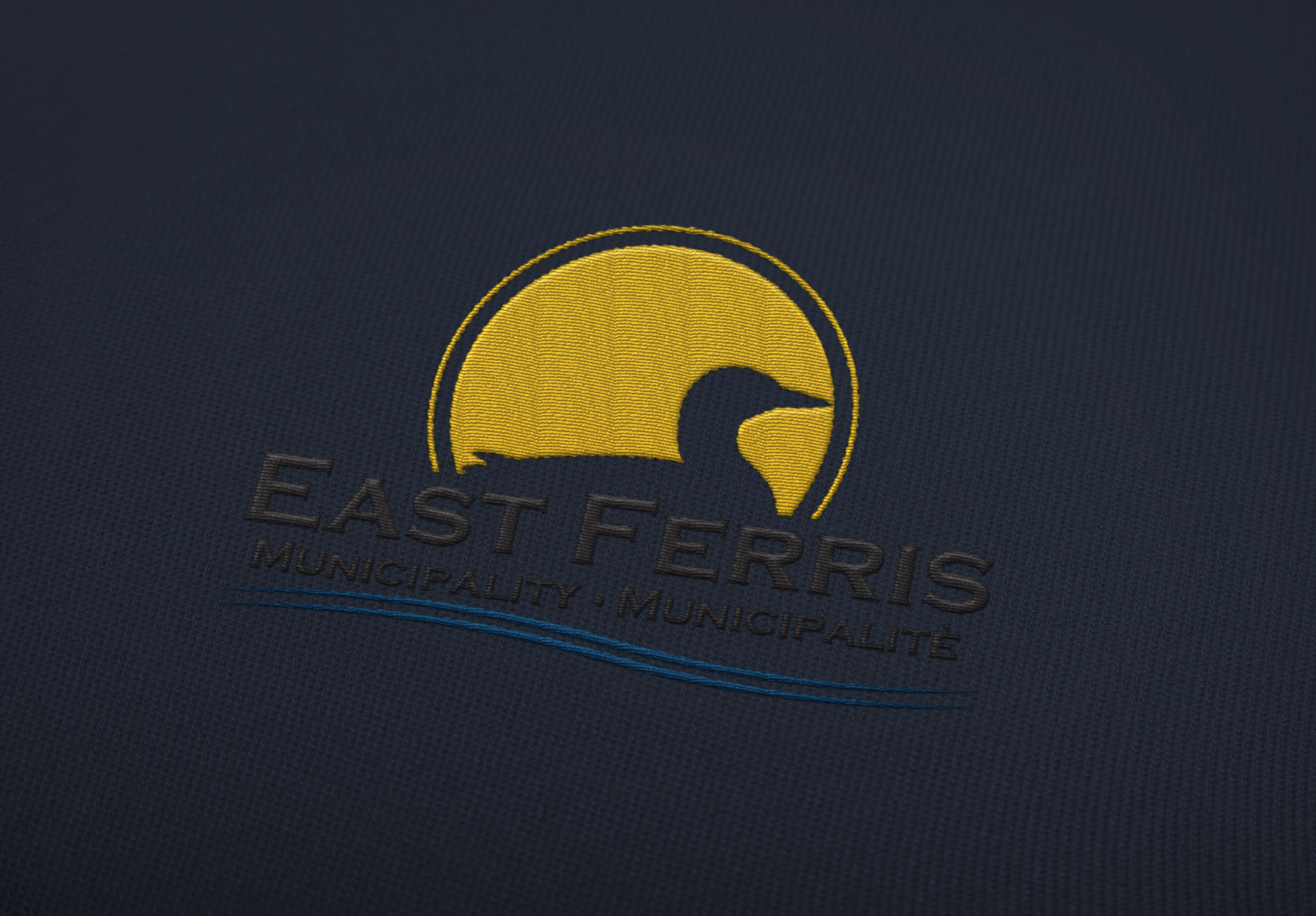
The project underwent a competitive evaluation at an institution, where it was pitted against submissions from numerous talented designers. It emerged victorious, securing the 1st place and earning the honor of being adopted by the East Ferris municipality. Subsequently, the design was entrusted to a specialized agency, which meticulously refined it, culminating in a polished final version that was embraced by the region.